Benefits Of Vertical Taskbar On Wide Screen Monitors
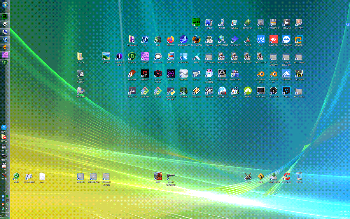
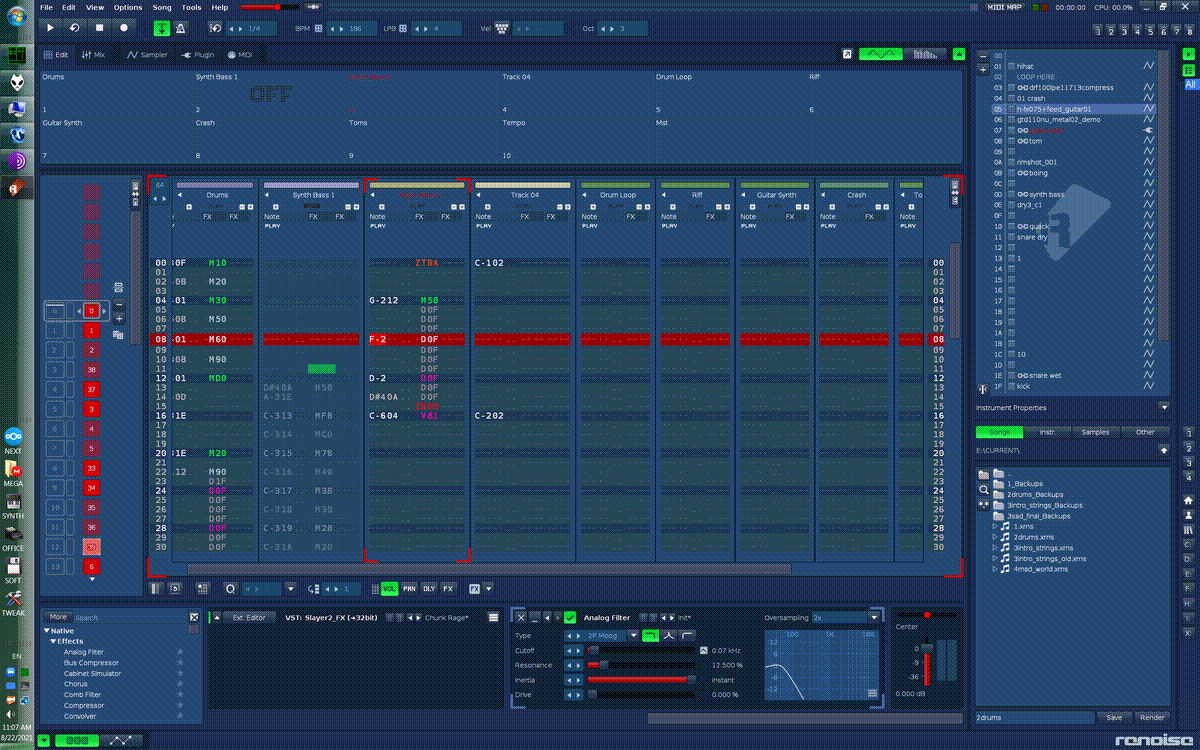
I don’t quite understand why people are using horizontal top [MacOS] or horizontal bottom [Windows] taskbars and not vertical one. Most of us are exploiting 16:9, 16:10 or even 21:9 displays. So basic logic confirms that we have more pixels in horizontal plane and less in vertical. So it’s better to save vertical space [pixels], but not horizontal ones. GUI of complex programs like to “eat” vertical space soooo much. This is why i prefer rare 2560x1600 resolution.

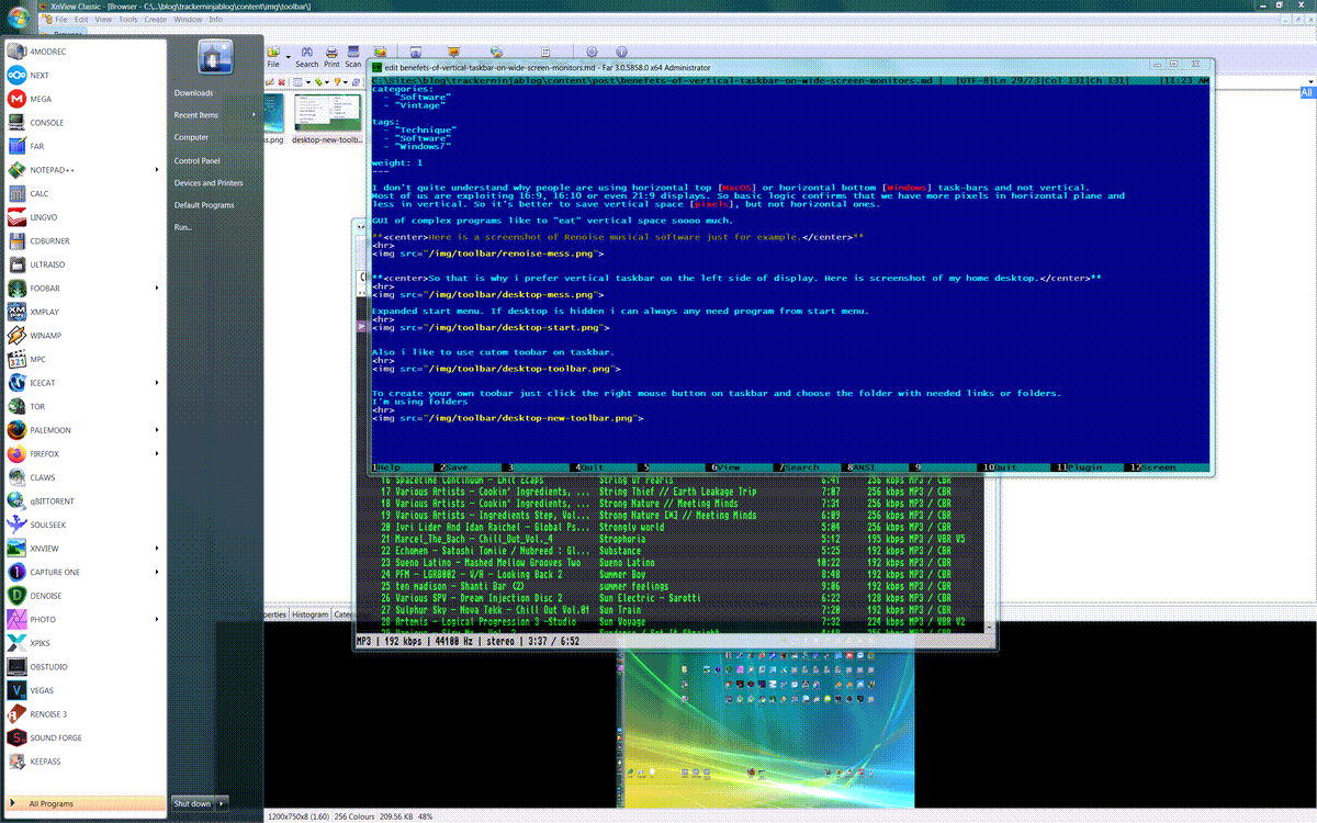
Also i like to use custom toobar on taskbar. Create folder somewhere. Put needed sub-folders. Like Office, Graphics, Audio, Games, whatever. Make shortcuts to desired applications.
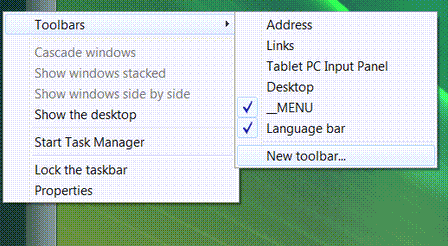
And yeah, you can sort folders by drag-n-drop.Now you have convenient toolbar menu. Just look at this perfection.
PS Make sure to check [Windows 98/XP/7 section] . I’ve added some new stuff and refreshed navigational layout of the page.
