
Why Is The Design Of Modern Websites So Awfully Bleak, Dull, Painfully Flat And Devoid Of Personality?

For the very life of me i cannot comprehend why most of commercial websites look like pale and completely uninteresting sh#t?
What could possibly be worse than a look of utterly boring template for a chosen framework?
A simple question keeps wandering through my mind:
Why were the 80s and 90s characterized by such vivid colors, whereas nowadays we lack them at all?
I am unable to grasp the primary concept and put it together.
Has vibrant colors become costly these days?
Or it looks like that they intentionally chipskating digital paint.
The Internet is riddled with web pages, begging not to be opened at all
or demanding closure within 5 seconds upon displaying intrusive,
unskippable full-screen pop-up ads demanding for paid subscription.
Bleak, flat icons, meaningless benefit lists with some nobody-wants-to-know facts.
It looks like the designers have depleted any imagination and creative spark.
Occasionally, I harbor the suspicion that those responsible for page development possess little understanding of
how things should work and furthermore show no intention of utilizing their own products after they created them.
I think that such disposition of things is woefully wrong and should be fixed.
However, I remain skeptical regarding such feasibility.
As a matter of fact, i can go on ranting on this topic forever, but i won’t because i have better things to do.
Simply highlighting the issue here, allowing you time to reflect upon it.
Additionally, I’m nearly certain that many readers share similar concerns.
The main answer is quite predictable. Businesses simply seek ultra rapid creation of websites, frequently neglecting
common sense, logic, usability, aesthetics, and occasionally even security measures.
And now to the question of semantics.
While “learning” i received useless information regarding semantic spaces and indentation.
And now, here is an actual markup taken from a google AAA+ project.
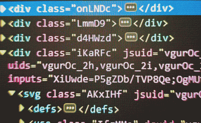
As you can see, practical implementation diverges significantly from idealistic academic teachings.
Spaces and indentations are just flowers compared to such “professional” div naming convention.
So, yeah, i’m out of here and have no more commentaries today, see ya around!
